Overview
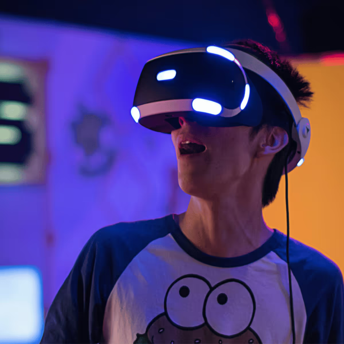
Virtual reality can be (should be) understood as a medium of its own, with an unique language, set of tools and resources that separate it from flat screen experiences such as regular video games and movies.
So in the same way a filmmaker has to think differently about framing, lighting and editing when creating 360 experiences, game design for VR can be something completely different from “ordinary” game design.
We’ll take a tour through a series of general notions of VR design and development that can prove useful for most VR game projects (of course this list isn’t pretended to be an exhaustive list of everything ever on the subject, as both VR technology and game design sensibilities change everyday).
Probably most of you already know about some (or many!) of the tips described in this article. There are many more out there, even enough to make a couple of more of these, we’ll see. Our goal here is to give game developers that are new to VR some tools that are, or maybe should be, standards on top of which to construct better and more engaging experiences.
But first, a little bit of vocabulary:
Degrees of freedom
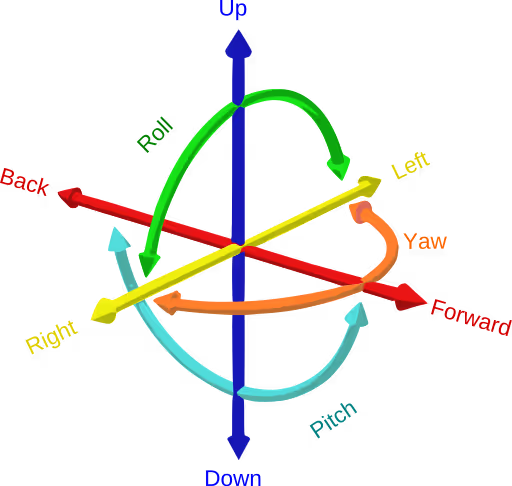
This might be a no-brainer at this point but also maybe that’s just me thinking that because I'm so used to it: the amount of control in space we got on our headsets, hand controls (and hands) is measured in degrees of freedom (DoF).
There are Headsets that only register rotation, we say these have 3 degrees of freedom (for each of the three axes it rotates on). Headsets that also register movement/translation in space have 6 degrees (three for rotation, three for translation).
Most sets nowadays have 6 DoF on both the headset and the controls, but it’s still important to think in these terms for a couple of reasons: a lot of homes don’t have the latest Meta Quest or Apple Vision Pro, so we have to take that into account when thinking about our target audience. Also, the use of 3 or 6 DoF sometimes might not be about hardware limitations but about design intentions or media specifications. 360 videos only have 3 DoF for example, so on that same road, we might want to limit the movement of our users in certain cutscene-like situations.
Tips for a better VR game design and development
Controls
About the act of painting a picture I once heard that, when you work in small scales you paint with your hands and fingers, in larger scales you start painting with your arms and shoulders, and eventually you paint with the motion of your whole body. I like the idea that this implies each approach is a completely different experience, and involves a different expression.
In video games we can move a joystick to swing a sword, or we can press a button to crouch, or dodge. In VR we actually swing, crouch and dodge with our actual body. This doesn’t only change the way we have to think and design, but also the way the player engages with the experience.
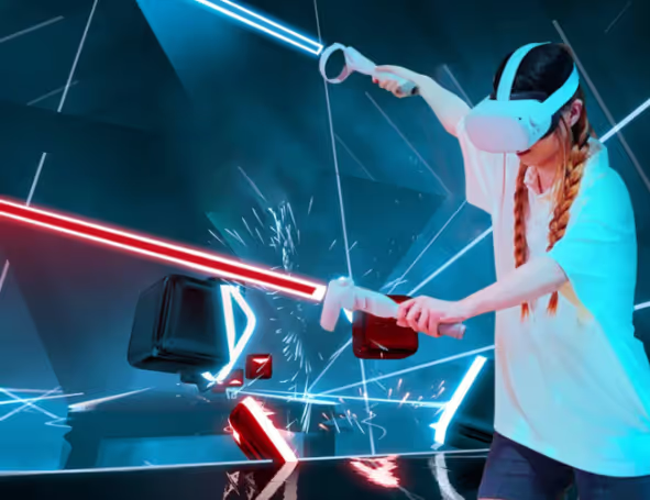
Nowadays, latest VR devices also include hand tracking, where you can interact using solely your hands, no controller needed. As attractive as it might sound, it can be quite awkward and prove not very useful for a lot of games (and players). Usually in shooter games your avatar is holding some type of device or weapon, so why not do that in real life by holding a controller?
As with everything, our design approach is set by the type of experience we want to convey. This being said, a lot of users won't find themselves comfortable controlling stuff with only their hands (losing the feedback from the virtual world the controls communicate, such as haptic feedback or button resistance), at least in the present time. Surely hands tracking is here to stay, and both hardware technology and user adaptation have a long way to go, but for now its an area not yet so explored, and that comes with its own obstacles.
Locomotion
When we talk about locomotion, we mean the approach we use to move across the space in our game world. There are A LOT of ways of doing locomotion, if you are looking for a comprehensive list of them, you can check Locomotion Vault. Here, we can quickly look through a couple of the most widely used techniques.
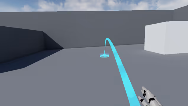
Teleporting is one of the most popular locomotion techniques: a laser-like tool in one of the controls points to a nearby location in space. When the player presses a certain button, they get teleported to that location. This can occur in an instant way, or with a really quick interpolation between the previous and the current position. The further approach can cause a little more dizziness but on the other hand, it's easier for the player to orient themselves by seeing where they are being taken rather than simply blinking and appearing in a different place.
Joystick movement is an approach more similar to regular video games. You push the stick in the control in a certain direction, and you move in that direction. As simple and intuitive it might sound, it can actually be a little confusing and sickness-inducing, because your eyes tell your brain you are moving, but your inner ear (the one responsible for your balance sense) is telling otherwise.
Flying can be an attractive alternative, it certainly sounds good and presents a lot of possibilities to play with. The downside is, of course, motion sickness. A whole lot of it.
Motion Sickness
Is no secret that motion sickness is one of the main concerns that VR development has to manage.
Luckily, at this stage in the actual hardware technology, sickness isn’t usually caused by the device itself, but by bad design or development: something we can work out.
A common cause for motion sickness has been the frame rate of an experience: going anywhere below 90 frames per second is known to cause sickness, so we need a high (and steady) frame rate.
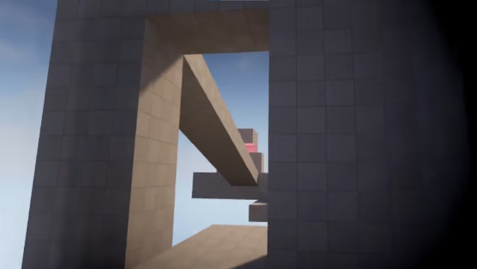
Games and experiences that rely a lot on player movement tend to be the most sickness-causing. Tunneling is a popular way to reduce the dizziness caused by these movements. With tunneling, we obscure most of the player’s visual range, leaving only the main point of interest (in front of the player) clear to sight. The principle is the same as going in a car: as said before, our brain gets confused when we see movement but our inner ear doesnt feel it. But when we are in a car this does not happen, cause we ourselves are not moving, we are inside an object that is moving, and our brain knows that, as it can see the dashboard, roof, and sides of the vehicle through the side of the eye.
Also something great about tunneling is that, most of the time, players can even tell the tunneling is happening, as their focus is elsewhere. At most, they can sense something different but they don't usually pay attention to it.
Body Movement
Almost since its beginnings as a genre, first person shooters have relied on the strafing mechanic. Moving our avatar sideways while shooting and getting in and out of cover is such a widespread mechanic that we cannot even imagine the FPS genre without it. But designing a first person VR shooter, with this type of movement in mind can be a mistake. Think about it, when was the last time you moved like that in real life, if ever? Making the user move in a way they aren't used to can lead to really uncomfortable situations, like eventually tripping and falling.
Instead, crouching and dodging in place can be much more intuitive and safe movements for the user to involve in during a video game session. In some cases sidestepping not more than one step can prove useful and not that hard to perform.
UI
In what user interface regards in VR games, a maybe obvious statement can be that all interfaces must be in world space. That is, physically positioned, rotated and scaled in the virtual world as opposed to “glued” to the screen as it is more common in flat screen videogames (because there’s actually a screen, duh). We can take this idea to the next level and say, if every interface in the experience is in world space, why not make every interface diegetic?
By diegetic UI we mean the UI elements that exist as part of the game’s world and narrative, and make sense inside of it.
A lot of times we can see experiences that achieve near-perfect levels of immersion, only to be obstructed by non-diegetic UIs, taking the user out of that world instantly. Job Simulator -and it’s kind-of sequel Vacation Simulator- does a beautiful job in making absolutely every interaction in the game world completely diegetic.

Haptic Feedback
In virtual reality, a lot of times our hands interact with virtual objects, which can be quite tricky for our brain. We are used to a clear, instant tactile feedback when reaching for and grabbing objects in real life, so to not have that collision with the virtual object can be hard to get used to.
Here’s where haptic feedback comes in handy: the controlled motions and vibrations of our controllers can help us communicate stuff like closeness to an object, resistance or collision. Here are some examples:
-Vibration can imply closeness to an object, increasing it’s magnitude as the distance decreases.
-A high, stable vibration can tell us when we get out of the interaction zone, suggesting us to go back to a position where that vibration stops.
-The trigger’s brake is useful to convey resistance like the one you get from stretching a bow’s string. Vibration is also useful here.
-A little tap when grabbing or snapping to an object.
-A big tap when violently colliding, like a sword against another.
Home VR vs Location VR
When developing VR experiences one key aspect of the whole design approach we must take into account is the actual place the experience is gonna take place. Like, in the real world. A videogame can be designed to be played in your living room or it can be designed to be played in its own dedicated space inside an arcade center.
Most people don't have a 4 meter by 4 meter clear space inside their house to play VR experiences where they have to displace (translate) their whole body from one corner to the other. Actually, most people don’t even want to do that in their living room. They usually want to have a relaxing and comfortable experience, by sitting down on the couch if possible.
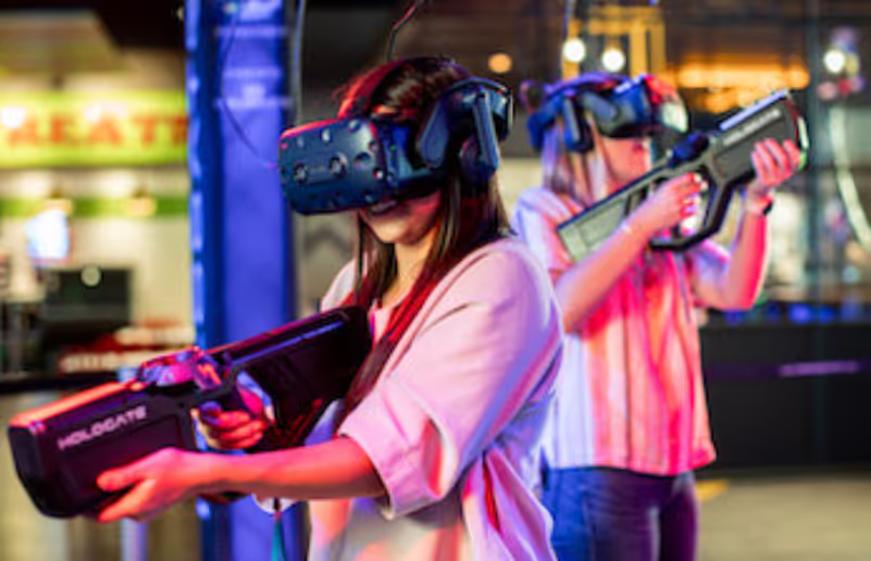
Location based VR, on the other side, are experiences meant to be played at VR arcade centers. Here, the locomotion approach of the experience can go for a more body-active version, also because the player is up to it. Think of it as the next level of laser tag or paintball.
Online Multiplayer
Here’s a tip worth both for VR games but also for every first person multiplayer game: usually the most secure way to do online multiplayer is with a deterministic approach. That is, a centralized server that “approves” every input and interaction in the game world before communicating those changes to each player (or client). The downside is that the path all the information has to travel to eventually reach the client can be long, and take more than a couple frames a lot of times which will cause our controls not to be instantly responsive. In an RTS this can not be such a big issue, but in first person games (as most VR games are) it can be really annoying and it can cause, again, motion sickness.
So how can we get determinism while at the same time get an immediate response for our input you might ask. We can actually let the player move and make their inputs instantly in their local session, and then when we get the “certified” information from the server, correct the game state in case it's necessary -by teleporting or lerping the player to the correct position for example-. This way the player will feel a snappier feedback with a lot less motion sickness.
Mixed/augmented reality
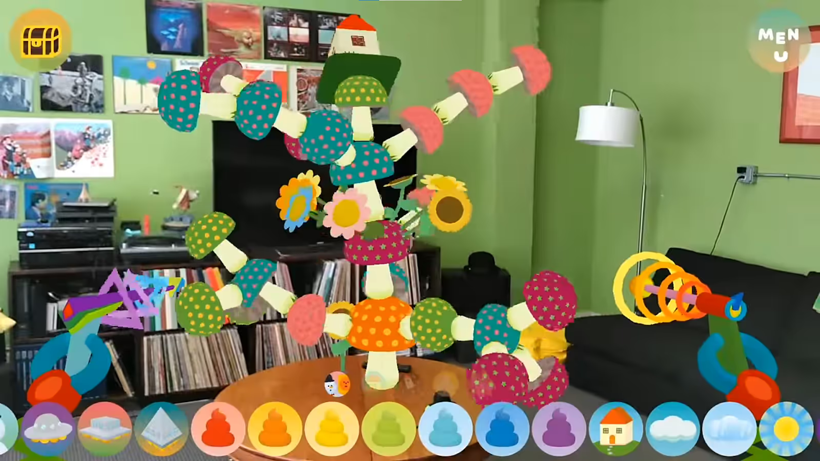
Mixed or augmented reality (MR, AR) are possible in most of the headsets we can access today. That is, combining virtual elements with the real world -usually, the real world seen through the headset’s integrated cameras-. MR/AR experiences come with a lot of advantages: motion sickness can be widely reduced when players actually see the world they are moving in, for the same reason it's really hard for them to trip over, or hit a wall.
The drawback is that now your experience is set in the user’s living room, and that can be limiting for the design. It's hard to make someone believe they are a space pirate in a spaceship when they are seeing their room the whole time.
A good designer is one that turns a drawback into an opportunity nonetheless they say, and MR/AR is a land full of them.
Closing words
As hinted more than once in this article, some of these tips are tied to current hardware specifications and a whole lot more to design and market sensibilities, all of which can (and will) change through time. However, most of these changes will develop on top of current techniques and applications so we feel it's important to know and understand current trends, its strengths and flaws to be able to predict (or even develop) what's next to come.
Virtual reality games are still a fresh discipline (and language) with a lot of potential to experiment and innovate. The purpose of this article is to be just another set of tools in the ever growing toolbox each of us can use to exploit this potential and push the medium forward. If you are looking to dig further, this GDC talk tackles a lot of design issues similar to the ones described here. From there on, there’s plenty of room for each of you to come up with new solutions to these challenges (and to discover new challenges also!).


.avif)
